Good Email Response Rate Benchmarks by Sequence Type
Different email sequences need different benchmarks to measure success.

A "good" reply rate depends entirely on what kind of sequence sent it, and treating every email metric as one undifferentiated pool is the single most common mistake in outbound reporting. Cold outreach to a net-new contact, a Day 10 follow-up nudge, an intent-triggered email fired the moment a prospect hits a pricing page, and a re-engagement message to a lead who went quiet three months back all live under different conditions. Checking every one of them against a single number is how GTM teams talk themselves into either false alarm or false comfort. This piece breaks the benchmark landscape apart by sequence type, so the number a team checks its work against is actually the right one for the job.
The split shows up in the data itself. A 2025 study of B2B campaigns by Belkins puts the average reply rate at 0.45%. A 2026 report from a major outbound platform puts the platform-wide average at 3.43%. Both numbers are real, and both are close to useless without knowing the denominator behind them. Platforms like Cardinal, which runs AI agents across prospecting and outreach, surface this distinction by tracking sequence-level reply data separately from raw send volume. A 5% reply rate against people who opened the email and a 0.45% reply rate against everyone the email was sent to can describe the exact same campaign. Without knowing which base a benchmark used, the percentage by itself says almost nothing, and most teams never bother to ask.
The macro decline that makes context matter even more
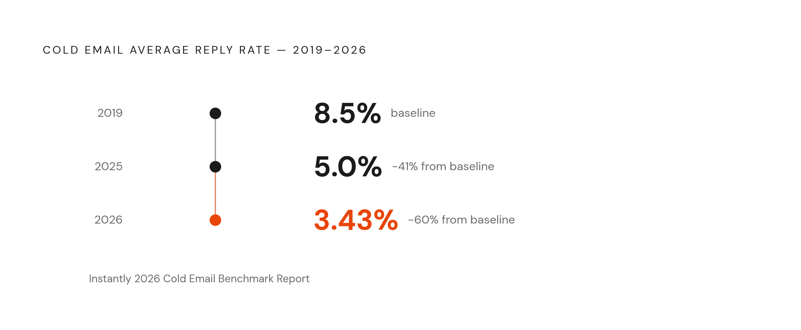
Cold email reply rates have been falling for years, and the line is not subtle. Instantly's 2026 cold email benchmark report tracks the drop from 8.5% in 2019 to 5% in 2025 to 3.43% in 2026. That's a collapse of more than half in under a decade, and it did not happen for one reason. It happened because three separate forces stacked on top of each other, and most teams are still only fighting one of them.
Inboxes got more crowded; most professionals field over 120 emails a day, so every message competes against a wall of noise before anyone opens it. Spam filtering tightened on top of that, especially after Google, Yahoo, and Microsoft rolled out stricter bulk sender rules across 2024 and 2025, pushing more borderline outbound straight into spam before a human ever sees it, and damaging sender reputation scores in the process. Underneath both sits a trust problem years in the making: a flood of generic, AI-written mass outreach has trained recipients to spot low-effort email on sight, and generic AI-generated messages now see roughly 90% lower response rates than personalized ones. That third force is the one worth sitting with, because it means the tools making outbound easier to send are the same tools making it easier to ignore.
Seasonality plays its own role, smaller but real. Belkins' 2025 dataset shows reply rates peaking at 0.54% in February and bottoming out at 0.35% in December, so the calendar month a sequence runs in shifts the baseline it should be judged against.
None of this means outbound is broken. Undifferentiated outbound is broken, and sequence type plus targeting quality now carry more weight than raw volume ever did. That is the thread running through every section below, and it is worth holding onto before the numbers start piling up again.
Cold outreach to net-new contacts: what average and excellent actually look like
Start with the plain case: a first-touch email to someone with no prior relationship, no inbound signal, nothing at all. This is the hardest category to perform well in, and the numbers show it. Undifferentiated cold outbound to broad lists lands in the 1-3% response rate range, and Belkins' 2025 data shows larger campaigns, 500 recipients or more, averaging just 2.1%.
A genuinely good reply rate today starts above 5%. Hit 10% or better and that counts as excellent across most B2B industries. Top-quartile senders reach 15-25%, but nobody gets there by sending more email. Getting into that tier means doing several things differently at once, which the sections below unpack one at a time.
Here is the sharper way to see it: one team moved from a 2% reply rate to 11% by narrowing its ideal customer profile (ICP) from "all SaaS companies" to "Series B SaaS companies using Salesforce with 50 to 200 employees." Nothing else changed. Specificity, not volume, moved the number, and that is exactly the instinct most teams get backwards. When a reply rate goes flat, the reflex is almost always to widen the list, buy more addresses, cast a bigger net. The list needs to get smaller and sharper, not bigger, because a wider net just means the same generic message reaching more people who have no reason to answer it.
Well-run cold campaigns across the wider B2B landscape in 2024 and 2025 cluster in the 3-5.1% range. A platform-wide average of 3.43% blends campaigns of wildly different quality, run by teams with wildly different skill levels; a team checking its own numbers against that figure, without confirming the denominator matches, is comparing itself to a number that may describe nothing like its actual situation.
So what counts as "cold outreach" for benchmarking purposes? First-touch email to a net-new contact: no prior signal, no prior relationship, no inbound action. Anything with even one of those factors present belongs in a different bucket, covered further down.
Follow-up sequences: the most undervalued performance lever in cold outbound
Here is a pattern that gets ignored constantly: follow-up emails add a meaningful share of replies to a cold sequence that the opener never would have captured alone. The bulk of replies a campaign will ever generate arrive after the opener, not because of it, because most prospects are not ready to respond on the first touch. Teams that judge a campaign off the opener alone are grading the wrong email.
High-performing sequences run multiple emails spread across several weeks, not one blast followed by silence and hope. Email cadence shape matters too, and spacing touches across the sequence rather than clustering them early tends to recover replies that would otherwise be missed. A sequence that quietly stops at Day 5 is leaving measurable, countable response on the table.
Follow-up performance and opener performance are not the same measurement, and they should never be benchmarked as one. The opener's only job is to earn a first glance. The follow-up recovers everyone who was not ready to respond on Day 0, which is most people. Track opener reply rate and total sequence reply rate as two separate numbers; a weak opener paired with a strong overall sequence rate points to a hook problem, not a list problem, and that distinction changes what actually gets fixed.
The practical upshot: a cold sequence generating 3% on the first send but running three well-spaced follow-ups will routinely beat a single "optimized" send that never gets a second touch. Benchmark the full sequence's total reply rate. Never judge one email in isolation.
Intent-triggered sequences: a different category, not just a better cold email
Intent-triggered sequences fire when a prospect shows a concrete buying intent signal, not on a fixed schedule: a funding round, a relevant new executive hire, a visit to a pricing page, a shift in the prospect's tech stack, a job posting that hints at a problem the sender happens to solve. These are structurally different setups from a cold blast to a purchased list, and the reply-rate data backs that up hard.
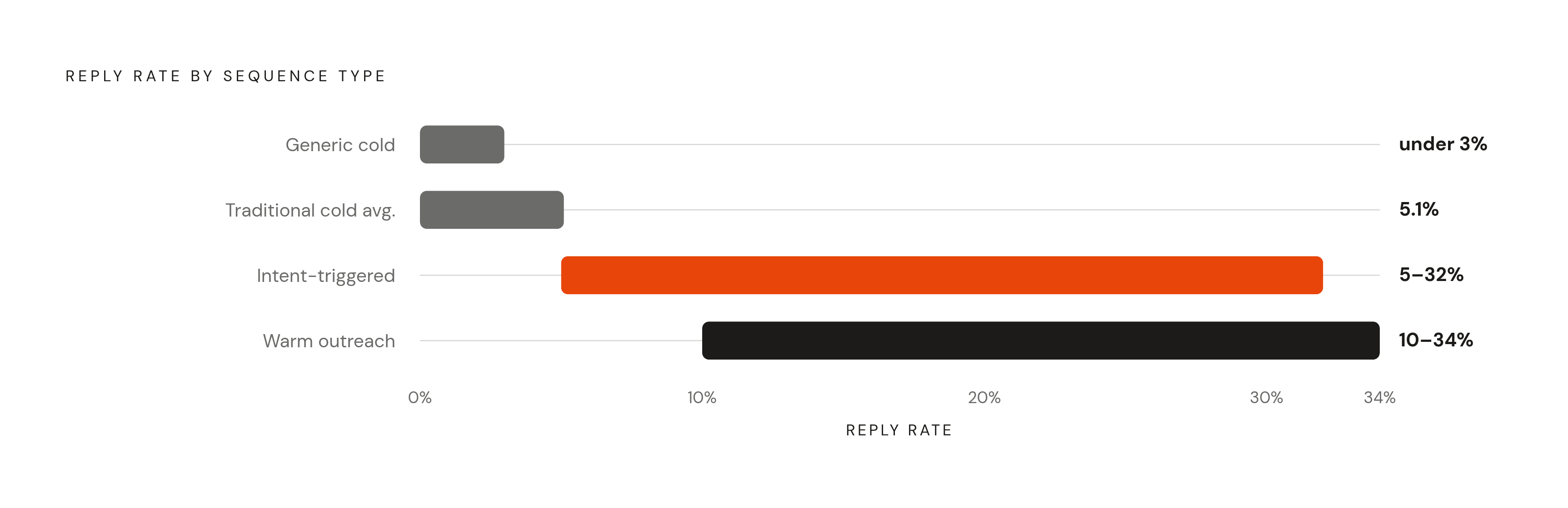
The gap deserves to be taken seriously rather than filed away as a nice-to-have. Traditional cold outreach delivers roughly 5.1% response rates on average, per one comparative analysis from Valley; signal-based approaches in the same analysis reach 32%. That is not a marginal lift from sharper copywriting. It is a structural difference in what the recipient experiences the moment the email lands. More conservative estimates tell a similar story: Buzzlead's analysis finds intent signals moving reply rates from under 1% for generic outreach up to 5-12%. Even the low end of that range beats undifferentiated cold outbound outright.
Why does the lift hold up across datasets rather than just looking good in one study? The prospect is already in motion when the email arrives. Something happened. Funding closed, a new VP started, a pricing page got a visit, and a relevant message landing in that window reads as useful instead of as interruption. Timing does work that copy alone cannot do on its own.
Different signals call for different personalization angles, too. A funding round implies growth pressure and urgency to scale fast. A new executive hire implies pressure to show ROI before the honeymoon period ends. A hiring surge in a relevant function implies scaling problems the sender might solve directly. A pricing page visit implies active, present-tense evaluation of the solution category.
Measuring an intent-triggered sequence against the 3.43% cold email average misses the point; these sequences should be benchmarked against each other instead. Is one signal type consistently producing 15% or better while another tops out at a notably lower rate? That comparison tells a team which signals to prioritize, and it beats checking against a generic cold outbound number every time. Delay erodes the value of a signal fast; a funding announcement from six weeks ago carries a fraction of the weight it did on day one, so the sequence needs to fire the moment the trigger hits, not whenever the next campaign cycle rolls around.
Warm outreach and re-engagement sequences: starting from a higher floor
Warm outreach, meaning any sequence sent to someone with a prior relationship, an inbound inquiry, or a past conversation, operates in a different trust environment. The recipient already knows the sender exists, and that single fact changes everything downstream.
Growleads' comparison shows the range clearly: cold email typically lands at 2-10% reply rates, while warm outreach reaches 10-34%. For proposal emails sent to leads already in active conversation, 5-10% is solid, 10-15% is strong, and anything above 15% on a focused, high-intent campaign counts as top-tier work.
Re-engagement sequences, reaching back out to a contact who went quiet after some prior interaction, sit in an odd middle zone. They carry name recognition, which cold outreach never has, but they have lost recency, which warm outreach usually keeps. Expect performance closer to the lower end of the warm range, unless the re-engagement hook anchors to something new and genuinely relevant rather than a generic "just checking in."
Here is a mistake worth naming directly: teams run re-engagement sequences with the same messaging as their cold campaigns, then benchmark the results against cold outbound norms. When that re-engagement sequence underperforms typical warm-outreach numbers, the sequence design is usually the problem, not the list. The right question for a warm sequence is not "are we beating the cold email average?" It is "are we converting prior interest into meetings at a rate above 10%?" That is a harder bar, and it is the right one.
B2B SaaS lifecycle and nurture emails: a different metric set entirely
B2B SaaS email splits into two buckets that do not belong on the same scoreboard. Lifecycle and marketing emails, the nurture drips, the onboarding sequences, the product update emails, run at roughly 20-40% open rates and 2-4% click-through rates (CTR). Cold outbound sequences run at 35-45% open rates, a figure inflated by tracking-pixel quirks and privacy features more than genuine opens, with 3-8% reply rates and roughly 1-2 meetings booked per 100 sends, according to SalesHive's 2025 benchmarks.
SaaS companies specifically sit at the bottom of the cold reply-rate range, frequently under 3%, because decision-makers in that category get hit with a disproportionate volume of outbound compared to other industries. Everyone is selling to the same VP of Sales, and that inbox knows it.
Applying a cold-outbound benchmark to a nurture sequence, or the reverse, produces a false read almost every time. A lifecycle nurture email sitting at a 2% reply rate might be performing exactly as expected. A cold outbound sequence sitting at 2% is mediocre. Same number, opposite conclusion, and that is exactly why sequence type has to be the first filter applied before any number gets judged.
For SaaS GTM teams, lifecycle emails are best tracked at click-through and downstream conversion, since a reply was never really the point of those emails to begin with. Cold outbound sequences should track reply rate, positive reply rate, and meetings-booked rate as three separate lines, not one blended figure. That meetings-booked number, roughly a small number per 100 sends for an average campaign, tends to be a more honest pipeline signal for early-stage SaaS teams than reply rate alone, since it filters out noise that never had a shot at becoming revenue.
The message variables that shift reply rates within any sequence type
Two teams can run what looks like the same cold sequence, to the same ICP, and land 2% and 15% apart. What explains a gap that wide? A handful of variables do almost all the work, and hook type sits at the top of the list. Hook type does significant work on its own, and A/B testing a timeline-based angle against a problem-based angle can move reply rates by a factor of two or more from a single copywriting choice.
Personalization depth stacks on top of that. Personalization consistently lifts reply rates across datasets, and the gains are substantial. Personalization here does not mean dropping in a first name. It means referencing something specific and true about the recipient's business that a mail-merge tag cannot fake: a distinct detail about their stack, their hiring, or their last funding round that proves a human looked before sending.
Cohort size matters on its own, independent of how personalized the message is. Belkins found larger campaigns of 500 or more recipients averaging just 2.1%, with smaller, more targeted campaigns outperforming them meaningfully. Smaller, sharper cohorts win even when both groups get equally personalized email; a list of 50 forces a level of targeting discipline a list of 2,000 rarely gets, if only because nobody can fake having read 2,000 LinkedIn profiles.
Length and call-to-action discipline round it out. Emails in the 50-125 word range with one clear ask consistently beat longer messages juggling multiple requests. Channel mix adds another multiplier on top of all of it: email paired with LinkedIn outreach, run in coordination, lifts reply rates 30-50% over email-only at equal volume, and sequences using three or more channels deliver 287% more responses than single-channel sequences, per benchmarks from outreaches.ai. A team judging its email-only reply rate against a benchmark built on multichannel coordination is grading itself against a standard it was never built to hit.
Tracking positive reply rate and the funnel past reply
Total reply rate is noisier than it looks. Roughly half of all replies fall into the neutral-or-negative bucket: "not interested," an out-of-office autoresponder, an unsubscribe request. None of that is pipeline. Positive reply rate, the share showing real interest, asking for more detail, or booking a meeting, is the number that actually forecasts revenue, and it needs its own line, separate from total replies. Blending the two together is how a campaign that generated forty auto-replies and two real conversations gets reported as a success.
The funnel narrows fast below the reply stage, and the narrowing is worth sitting with. Cold email-to-meeting conversion averages just 0.1% across B2B campaigns, per a 2025 Salesforge benchmark report; anything above 0.4% counts as strong. Cold email-to-closed-deal conversion averages 0.215% across industries in the same period, per a Focus Digital analysis, roughly one closed deal for every 464 emails sent.
Numbers like that make the case for sequence-specific benchmarking better than any argument could. If targeting and sequence type barely mattered, that funnel would not narrow this hard, or this consistently, across so many different campaigns. It does narrow this hard, which means sequence type and targeting quality are not a nice-to-have refinement sitting on top of outbound. They are the primary lever deciding whether the whole exercise generates revenue at a cost worth paying.
For early-stage and founder-led teams running sequences manually or with limited automation, tracking at the meetings-booked level, not just reply rate, gives the fastest feedback loop available. It shows what is actually converting instead of what is just generating activity that looks busy on a dashboard. A team that can see exactly which sequence type, which hook, and which signal combination produced closed revenue can cut the losing combinations faster and put more weight behind what works.
Every benchmark in this piece is a starting point, nothing more. The real work is building a sequence-specific baseline from a team's own numbers, tracking positive reply rate and meetings booked against that baseline, and adjusting until those numbers move the right direction. That is the only benchmark that ends up mattering for pipeline, and no industry report can hand it over ready-made.